By Scott Lazenby
When I was in graduate school, I served as editor of the school’s journal. Donald Stone, a pillar of the public administration scholarly world, contributed an article titled “On the Arrangement of Chairs.”
It was only partly tongue-in-cheek; he drew on his 20 years of experience helping organize the executive branch of the national government in showing how the placement of chairs can influence the effectiveness of different kinds of meetings.
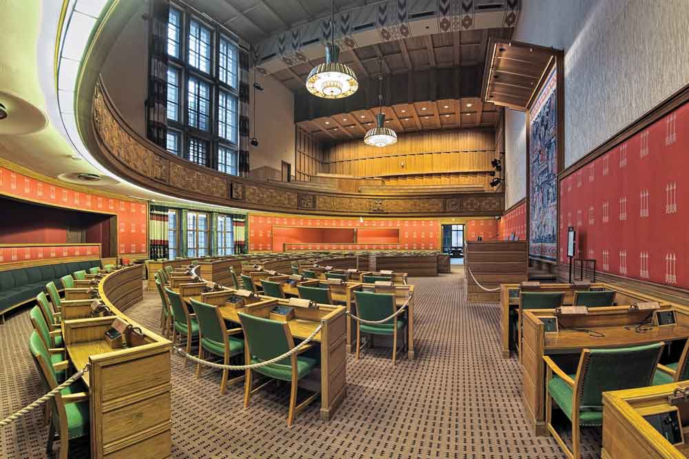
Over the past 40 years, I’ve had several opportunities to be involved in the design or redesign of council chambers. Each time, we faced similar challenges: How can we arrange the room so that the elected officials, staff, and audience can all see each other and also see presentation materials?
Can we raise the council dais enough so that members of the audience can see the councilmembers, but not so much that the council does not (symbolically) set themselves above their constituents?
A Flawed Concept
I’ve come to the conclusion that the basic premise of the council chambers design is flawed. The previous paragraph used the word “audience” twice, and you, as reader, probably thought nothing of it.
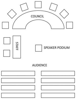
Webster’s defines audience as “a group of listeners or spectators,” as in live theater. And in fact, that’s typically the way council chambers are designed (see Figure 1, below).
Figure 1. The Basic Layout of Council Chambers

But what is the council’s role—to serve as entertainment for an audience or to be a governing board? If it’s the latter, why do almost no other governing boards arrange their meeting space the way councils do?
At the national level, members of the legislature face the leadership; the public can observe from a gallery. State governing bodies are typically arranged the same way. In the British parliament, members of opposing parties face each other, with the distance between the opposing benches being two swords’ length.
Governing boards of corporations and nonprofits typically organize themselves as shown in Figure 2. In this scheme, key staff (e.g., chief executive officer, chief financial officer) sit at the table with the board members. Support staff and members of the public—if the meeting is open to the public—typically sit in chairs against the walls of the boardroom.
Figure 2. Chair Arrangement of a Private Sector Boardroom

With the exception of city councils and county boards, a majority of the governing boards of the 90,000 local governments in the United States meet this way, too.(1) They are made up primarily of special districts, including rural fire districts or mosquito control boards, and it is rare for them to have much of an audience.
If this is an efficient way for private sector governing boards to conduct their business, why do local government councils use a live theater arrangement? The strongest argument might be that the community is the government closest to the people, and many residents are interested in the work of their elected representatives.
They are more likely to attend a meeting, especially if there is a public hearing on a hot topic and they have an opportunity to actively participate in the meeting.
The traditional arrangement also predates sound systems and video coverage, and we may be stuck with it more out of tradition than logic, in the same way that our modern online council packets can look pretty much the same as they did 80 years ago when everything was produced with a typewriter.
There are, however, arguments against this traditional arrangement:
With live streaming video, there is less of a need to be in the room to observe the proceedings. Some communities even take public input from the virtual audience, in real time, as the meeting progresses.
The typical arrangement, in which the council plays to the audience, encourages grandstanding by councilmembers and heckling from the crowd.
Setting staff off to the side works against the fact that the council and staff are (or should be) on the same team.
Councilmembers don’t face each other, which makes it more difficult to have a group conversation.
As to the last point, I have never seen staff members use the council dais for a meeting, even when all conference rooms are full. It is, in fact, a terrible arrangement for a productive meeting.
Keep in mind that, except for public hearings or the obligatory “resident comments” section of the agenda, the audience is there to observe rather than to participate. Allowing residents to observe their elected representatives at work is important. It’s a key part of openness in government.
The typical room arrangement goes beyond this, because it encourages continuous council and audience interaction, in the same way that a live theater troupe interacts with its audience.
Councils have enough challenges in serving as effective governing boards. They don’t get to pick their fellow board members, who may not necessarily have strong skills in teamwork, strategic thinking, or for that matter, interpersonal communication.
They have a finite amount of time to get their work done, and can get easily bogged down in administrative details, ceremonial and feel-good activities, and trivia. Using a room arrangement that emphasizes their role as entertainers rather than board members doesn’t help.
Considering Different Setups
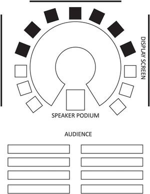
What if council chambers were arranged as shown in Figure 3? In this drawing, the shaded seats represent the governing body and the unshaded seats represent staff members. As a local government manager, I would put the city attorney and clerk on one side, as key advisers on meeting procedures and processes.
Figure 3. Optimal Arrangement A

I would join presenting staff on the other side as part of the team providing program analysis and recommendations. This strategy could be determined by individual preferences.
Here are the advantages to the Figure 3 arrangement:
- A (mostly) round table is more conducive to council discussion.
- Having staff physically at the table reinforces the idea that the staff and the councilmembers are on the same team. The dais can, however, be designed to make a visual distinction between elected officials, staff, and presenters, which is appropriate since it is the governing board that votes and makes the ultimate decisions.
- When residents are invited to address the council, they move into the circle with the council, which is less intimidating and more welcoming. It symbolizes that the council is inviting the speaker into their circle.
- Members of the public, when not participating, can observe the proceedings, but the council’s focus is on being a governing board, not playing to an audience.
- Large display screens provide easy viewing from any seat.
- The arrangement would work well for advisory boards, including hearing bodies, as well as for small staff meetings (i.e., comfortable chairs, good technology).
In Lake Oswego, we’ve experimented with this arrangement, and the councilmembers and staff like it so much we’ll make it permanent in our new city hall.
For the community that really dares to be different, there may be an even better arrangement. Oregon State University recently built a new, large classroom building. As much as it wanted to avoid it, the university had to include a 600-seat lecture hall.
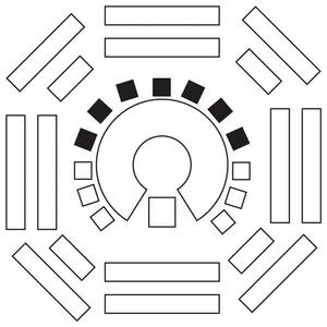
Instead of theater seating, where the students in the nosebleed section are far from the professor, they designed it with a raised stage in the middle, surrounded by seats. This meant the farthest student was only eight rows from the speaker, and by having students facing each other across the stage, it made them feel more engaged. Large screens on the walls helped with presentations.
What about a council chambers arranged like what is shown in Figure 4? When I proposed it to Lake Oswego’s council, they didn’t like the idea of people sitting behind them, possibly out of concern for personal safety, or maybe because they didn’t want anyone noticing if they checked their cellphone. I do, however, think it would be worth trying.
Figure 4. Optimal Arrangement B

Either of these two proposed arrangements would be conducive to all business meetings and informal work sessions of the council, including those that include formal public hearings. They are not conducive to town hall meetings or public forums where the chief objective is public involvement.
This, however, might actually be an advantage in that it provides a clear delineation of the objective of the two kinds of meetings. The “three minutes at the mic” that occurs during council business meetings may be required by law, but it is one of the worst possible ways to achieve effective resident engagement.
There are far better environments and processes for engagement; for example, meeting in a more open, less-formal space like a community center or school, and having councilmembers serve as hosts, moderators, and listeners in small-group roundtable discussions—is a topic for future consideration.

Endnote
1 2012 Census of Governments, https://www.census.gov/content/dam/Census/library/publications/2013/econ/g12-cg-org.pdf
New, Reduced Membership Dues
A new, reduced dues rate is available for CAOs/ACAOs, along with additional discounts for those in smaller communities, has been implemented. Learn more and be sure to join or renew today!
